Meet the Author: Lara Cain Gray
 A picture’s worth a thousand words, but a great picture book? Priceless!
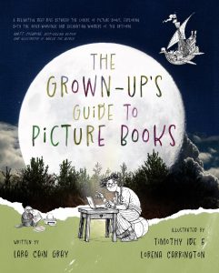
The Grown-Up’s Guide To Picture Books explores the complexities of modern picture books, from why our favourites tend to linger so long in our memories, to how we can maximise the deep reading opportunities they provide once we’ve learned to ‘read between the lines’.
For parents, carers, teachers, librarians, aspiring writers and any grown-up who simply loves picture books. This is your deep dive celebration of what makes a great picture book great.
Lara very kindly agreed to answer a few questions for Storylinks:
What made you decide on the alphabet format?
The original version of the book was a little more research-heavy. I’m all for taking children’s books seriously on an academic level, but I wanted this book to reach a broader audience – potentially people who are not already in the publishing or research industries. I decided to make it playful rather than arcane. With that in mind, the A to Z offered a way to organise the themes that gave a nod to children’s book traditions. It also means readers can easily dip in and out of the book according to their interest, or for use in the home or classroom.
How did you decide on what to put for each letter eg A is for Animals, but it could have been Angst, Aggro, Anger, – I suppose Animals is more wide ranging…
There are myriad other ways in which it could have been organised, for sure. I began with A for Animals because I had previously written an article about anthropomorphism that piqued my interest. And, as you say, I wanted each section to cover wide ranging concepts that could be applied to a broad selection of picture books. Some of the others – like E for Endpapers – represent elements of a picture book that I felt deserved their own letter. I didn’t want to just add endpapers to the I for Illustration spread, for example. As with any picture book, the challenges were X and Z, but Xenophobia and Zeitgeist provide perfect ways to open discussion about publishing trends, diversity and gatekeepers. There was a lot of mapping and reworking of letters and themes in the early drafts.
The illustrations are so witty and gorgeous – how closely did you work with the illustrators?
The illustrations are tremendous! I had never met Lorena or Tim before this project kicked off. Nor had they worked with each other. I’m so grateful for publisher Anna Solding’s creative risk taking. She had a vision to do something really different visually for this book – and it has worked. The team shared preview images with me along the way but I didn’t have any creative input. Other than to say ‘Wow! I love it!’ every time a file arrived.
Screenshot

